Three key design strategies for cognitive load
When it comes to designing HMIs and other interfaces, cognitive load is an important factor. Three design strategies are highlighted.

Imagine you’re on the beach, daydreaming as an ocean breeze wafts by you. Now picture a different scene. You’re debating the theory of time travel while solving a Rubik’s Cube and doing your taxes. In these two scenarios, a person’s mental state would differ substantially because of a concept called cognitive load.
Cognitive load refers to the amount of working memory being used in the brain. Working memory stores and manages information for things you’re actively doing, like remembering an address until you reach your destination. In the first scenario, relaxing at the beach, you’d experience a low cognitive load. During your time travel debate however, since you’re juggling three complex tasks, you’d experience a high cognitive load.

Cognitive load (the amount of working memory being used in the brain) is an important factor in HMI design. Courtesy: Inductive Automation
When it comes to designing HMIs and other interfaces, cognitive load is an important factor. High cognitive load in an application can cause misunderstandings, make it more difficult to use, and impact a user’s enjoyment. For a user-friendly experience, design in a way that minimizes a user’s cognitive load. To do this, there are three key strategies:
1. Eliminate visual clutter.
When designing for a low cognitive load, keep the mantra “less is more” in mind, and remove elements that don’t add critical information. Don’t go overboard with competing colors, since users may miss something if everything calls out for their attention at once. Be sparing with elements that have a strong visual presence, like animations or thick borders. And finally, be concise with copy and limit variations in a text’s font, size, and style. Having this minimalist mindset when designing helps to get rid of distractions so users can focus on what’s important.
2. Organize for intuitive navigation.
Your goal is to guide the user’s eye with your design, so organize things from left to right, and from top to bottom. Use grids to present things in an orderly fashion; grids create sections for your data and establish a set of rules for your interface. Group closely related items together and utilize white space to indicate that items aren’t as closely related. Organizing elements in a way that users find familiar will help them find what they need.
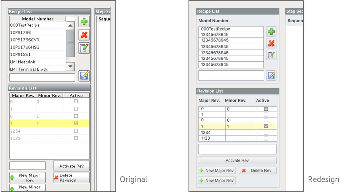
The screen on the right is designed to minimize the user’s cognitive load. Courtesy: Inductive Automation
3. Be consistent.
Consistency lets users know what to expect. So use consistent terminology; if you refer to an action with one term, don’t call it something else later. Use layouts consistently as well, if you lay things out in one way, repeat this throughout. Text styling should also receive consistent treatment, so if you put category titles in bold in one instance, do it in all instances. Consistency is essential so that users aren’t distracted or confused by inconsistencies.
By following these three strategies you can optimize your design for a low cognitive load. This results in a more professional-looking interface and a better user experience all around.
Jennifer Faylor is a content writer at Inductive Automation, a CFE Media and Technology content partner. Edited by Chris Vavra, web content manager, Control Engineering, CFE Media and Technology, cvavra@cfemedia.com.
Do you have experience and expertise with the topics mentioned in this content? You should consider contributing to our CFE Media editorial team and getting the recognition you and your company deserve. Click here to start this process.